The Best Colors for Commercial Spaces: The Psychology of Color in Business
Color Isn’t Just Design—It’s Strategy
When it comes to commercial painting, color choices go far beyond aesthetics. The colors you choose can influence how customers feel, how long they stay, and even how much they spend. This is the psychology of color in business—a subtle yet powerful design element that can transform how your space communicates your brand’s identity.
At Thoresen Painting, we’ve helped San Diego businesses—from restaurants and retail shops to offices and medical spaces—select color palettes that align with their purpose and personality. Whether you’re repainting a storefront or designing a new interior, understanding color psychology is the first step to making the right impression.
The Psychology of Color: How Paint Impacts Behavior
Color affects people on both a conscious and subconscious level. It can energize, calm, motivate, or even influence trust. Here’s a quick breakdown of what different colors tend to convey in commercial environments:
Blue: Trust, Calm, and Productivity
Blue is one of the most widely used colors in corporate environments—and for good reason. It evokes trust, reliability, and calmness.
- Great for: Offices, medical facilities, and financial institutions.
- Pro tip: Use lighter blues to make a space feel open and soothing, or navy for a professional, grounded look.
Green: Balance and Wellness
Associated with growth, health, and balance, green is a natural choice for wellness centers, spas, and eco-friendly businesses.
- Great for: Healthcare, fitness studios, and organic product retailers.
- Pro tip: Combine soft sage or muted olive tones with natural wood finishes for a calming, sophisticated space.
Red: Energy and Excitement
Red is bold, energetic, and attention-grabbing—but it must be used carefully. It can encourage appetite and stimulate energy, making it a favorite in the restaurant and retail industries.
- Great for: Restaurants, gyms, or entertainment venues.
- Pro tip: Use red as an accent rather than a main color to avoid overwhelming your customers.
Yellow: Optimism and Warmth
Yellow evokes feelings of happiness and creativity. It can make spaces feel inviting and bright—but too much can feel overstimulating.
- Great for: Cafés, creative studios, and children’s environments.
- Pro tip: Stick to warm, muted tones of yellow for a professional look that still feels cheerful.
Gray and Neutral Tones: Modern and Versatile
Modern commercial design trends often favor neutrals—gray, taupe, beige, and white. These tones convey professionalism and allow your branding or décor to stand out.
- Great for: Offices, showrooms, and upscale retail.
- Pro tip: Layer neutral shades with accent walls or texture (like epoxy flooring or mural work) to add visual depth without overwhelming the space.
Matching Color to Your Business Type
The right color can amplify your brand identity and even affect your bottom line. Here’s how to match color strategy to your business type:
Retail and Hospitality
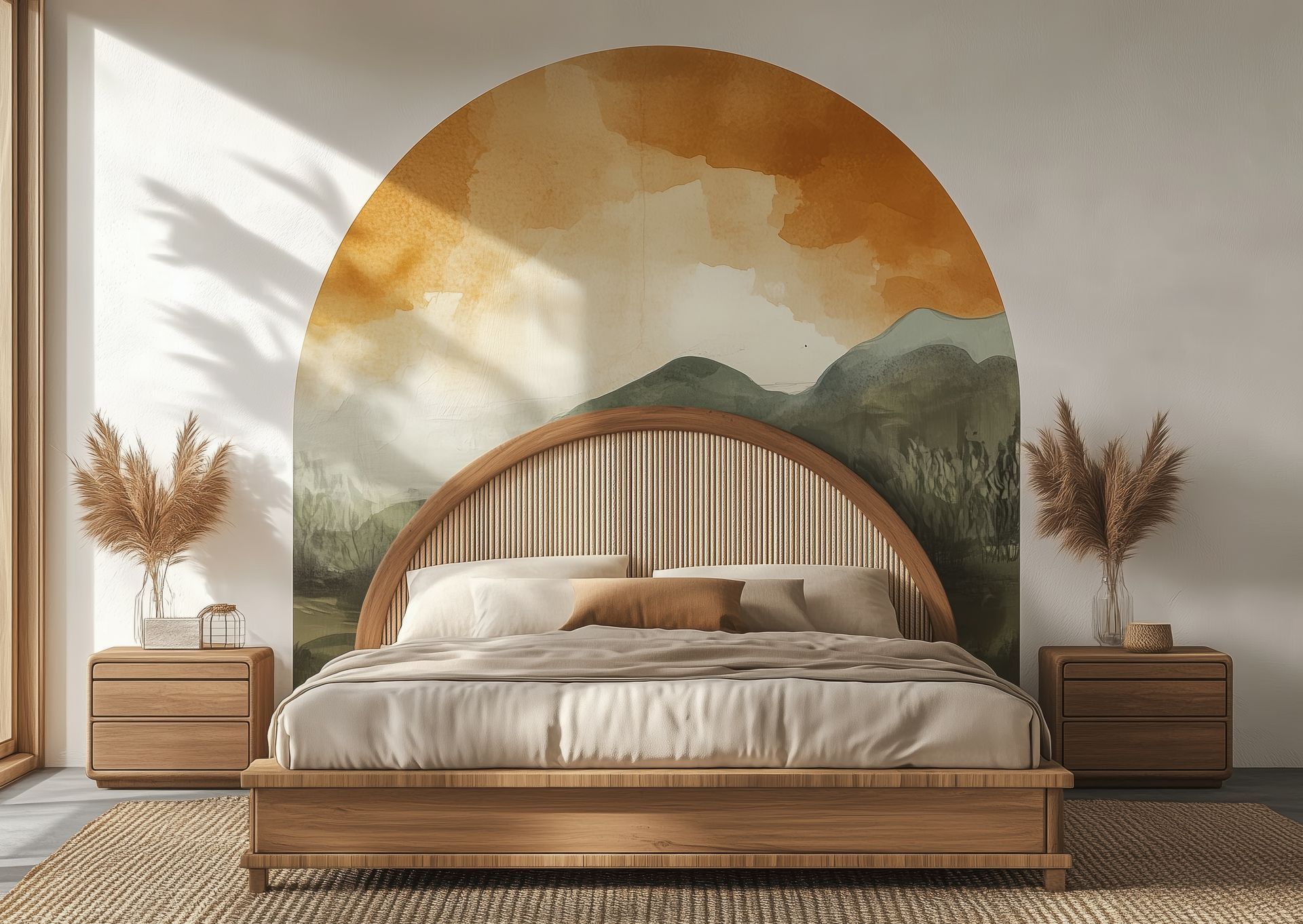
Color plays a direct role in shaping customer experience. Warm, inviting tones like terracotta, soft gold, or muted coral can make customers linger longer. In contrast, luxury brands often use deep neutrals and jewel tones to create exclusivity.
Offices and Professional Spaces
For office environments, color affects
focus and productivity. Blues and soft greens encourage calm and concentration, while subtle yellows can promote creativity and optimism.
Avoid overly bold shades that might distract employees or feel too intense over long periods.
Restaurants and Cafés
Appetite and color are closely connected. Reds and oranges can stimulate hunger and conversation, while earthy tones and warm neutrals help diners feel comfortable and relaxed.
Cooler colors like blue or gray are less common in dining spaces, as they can reduce appetite.
Healthcare and Wellness
Trust and tranquility are key in medical and wellness environments. Soft blues, greens, and neutrals create a sense of cleanliness and calm that puts patients at ease.
The Role of Lighting and Finish
Color doesn’t exist in isolation—lighting and finish play major roles in how paint looks and feels in your space.
- Natural light: Amplifies brightness and warmth; consider softer tones to balance.
- Artificial light: May alter color appearance—LED lighting can make colors look cooler, while warm bulbs enhance reds and yellows.
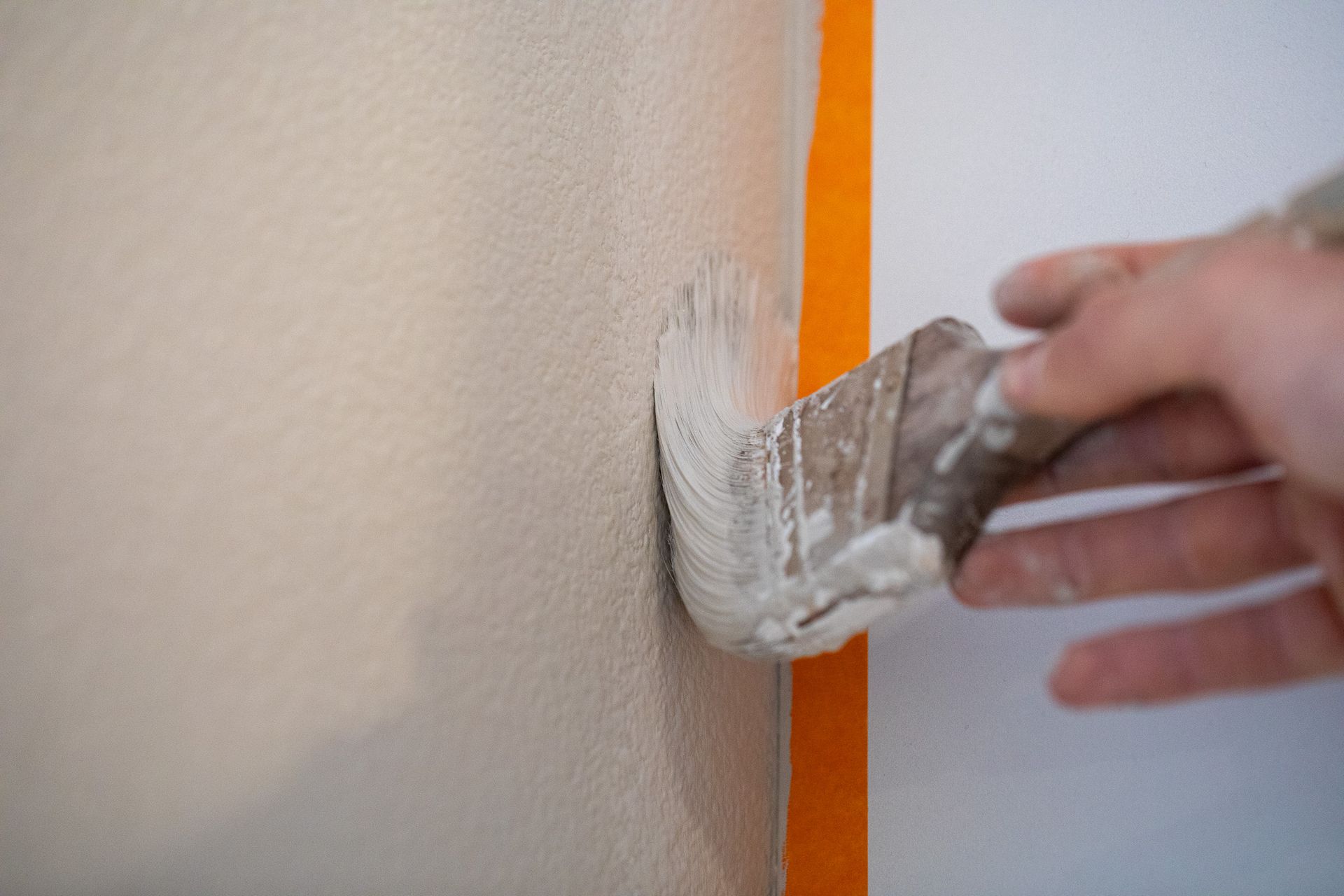
- Finish selection: Glossy finishes add energy and reflectivity, while matte or eggshell finishes create a calm, elegant feel.
At Thoresen Painting, we consider all these factors during your color consultation to ensure your selected palette performs beautifully in your real environment—not just on a color swatch.
Beyond Paint: Texture, Murals, and Epoxy Finishes
Color isn’t the only way to make an impact. Our team specializes in mural painting and epoxy flooring, which add both personality and durability to your commercial space.
- Murals: Custom designs or branded graphics create a memorable customer experience and set your business apart.
- Epoxy flooring: Adds sleek style with long-lasting performance—perfect for showrooms, garages, and industrial spaces.
Together, these design elements can transform your commercial property into a space that reflects your brand’s character and ambition.
Let Thoresen Painting Bring Your Vision to Life
Choosing the right color palette is both an art and a science—and it’s one of the most impactful investments you can make in your business environment.
At Thoresen Painting, we combine expert craftsmanship with a deep understanding of color psychology to help your commercial property look its best and perform its purpose. Whether you’re refreshing a single office or painting an entire retail complex, our team will help you select colors that make a lasting impression.
Call us today to schedule your color consultation and discover how the right palette can transform your space—and your business.me.